CSS中的居中对齐
前端
CSS
在CSS中文字水平居中的方法为:
text-align:center;而元素的水平居中,通过设定 margin-left 和 margin-right 的值为 auto 实现,如:
margin:0 auto;单行文字的垂直居中
通过设定文字的行间距等于容器高度可以实现,例如:
.center-text-trick {
  height: 100px;
  line-height: 100px;
}
多行文字的的垂直居中
可通过利用表格的垂直居中属性 vertical-align 来实现,例如:
<div class="center-table">
  <p>I'm vertically centered multiple lines of text in a CSS-created table layout.</p>
</div>
.center-table {
  display: table;
  height: 250px;
  background: white;
  width: 240px;
  margin: 20px;
}
.center-table p {
  display: table-cell;
  margin: 0;
  background: black;
  color: white;
  padding: 20px;
  border: 10px solid white;
  vertical-align: middle;
}
元素的垂直居中
在不知道元素高度的情况下,可以通过绝对定位来实现,例如:
<!DOCTYPE html>
<html>

<head>
    <meta charset="utf-8">
    <meta http-equiv="X-UA-Compatible" content="IE=edge">
    <title>元素垂直居中实例</title>
    <style>
    main {
        background: white;
        height: 300px;
        margin: 20px;
        width: 300px;
        position: relative;
        resize: vertical;
        overflow: auto;
    }

    main div {
        position: absolute;
        top: 50%;
        left: 20px;
        right: 20px;
        background: black;
        color: white;
        padding: 20px;
        transform: translateY(-50%);
        resize: vertical;
        overflow: auto;
    }
    </style>
</head>

<body>
    <main>
        <div>
            我是一个块级元素,高度未知,我在父元素中垂直居中。
        </div>
    </main>
</body>

</html>
当我们不知道元素的宽度和高度时,可以使用如下的方法:
.parent {
  position: relative;
}
.child {
  position: absolute;
  top: 50%;
  left: 50%;
  transform: translate(-50%, -50%);
}
对齐弹性容器中的弹性项目
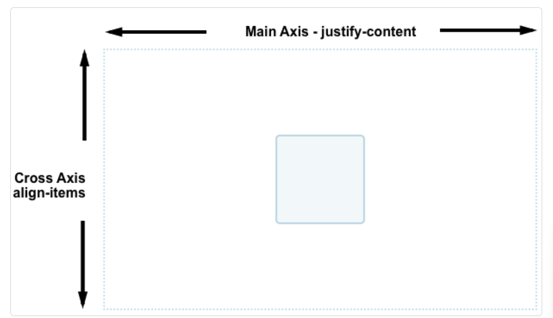
Flexbox 之所以能迅速吸引开发者的注意,其中一个原因就是它首次为网页样式居中提供了合适的方案。得益于它提供的合适的垂直居中能力,我们可以很轻松地把一个盒子居中。为了使我们的盒子居中,通过align-items属性,可以将交叉轴上的 item 对齐,此时使用的是垂直方向的块轴。而使用justify-content则可以对齐主轴上的项目,主轴是水平方向的。
.box {
  display: flex;
  align-items: center;
  justify-content: center;
}

.box div {
  width: 100px;
  height: 100px;
}

<div class="box">
  <div></div>
</div>
效果如下:
